

WordPress Slow on Mobile Only? How to Find the Mobile-Only Cause
Your site feels fine on a laptop but slow on a phone. This guide shows why that happens, how to test it properly, and what to fix first for mobile…
Umair Khan •
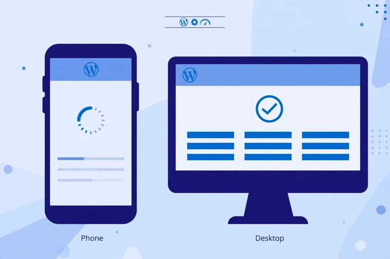
A site can feel perfectly fine on a desktop and still frustrate visitors on a phone. The owner checks it on a laptop, sees it load quickly, and wonders why mobile visitors leave. The visitor on a phone is not imagining the problem. A phone, a mobile connection, and a smaller screen change how a page loads, and a site that is only tested on a desktop can hide that difference completely.
This guide is for one symptom only: wordpress slow on mobile only. If your site is slow everywhere, start with the broader diagnosis guide instead. If it is slow only on a phone, work through the checks below in order, note what changes, and fix one likely cause at a time.
Why does my site feel fast on desktop but slow on a phone?
A desktop and a phone do not experience the same page in the same way. A desktop usually has a faster processor, more memory, a larger screen, and a stable connection. A phone has less processing power, a smaller screen, and a connection that can vary as the visitor moves. A page that a desktop handles easily can still strain a phone.
Layout also matters. A desktop layout can spread content across a wide screen. A mobile layout stacks the same content, and it may load extra sections, menus, and scripts that were designed for a larger screen. A page builder can add layout code for every screen size, even if a visitor only sees one version. That extra work is felt most on the device with the least power to spare.
Another difference is what the visitor notices first. On a desktop, a large hero image, a slider, and several sections can appear at once. On a phone, the first screen is much smaller, so a slow hero image or a blocked headline is far more obvious. The page may eventually load fully, but the first impression is already lost. That is why a mobile-only problem needs mobile-only checks, not a repeat of desktop checks that already passed.
For a broader view of what visitors and search engines experience, the Core Web Vitals guide for WordPress explains loading, interaction, and layout stability in plain terms.
Is the mobile test itself making the result look worse?
Before changing anything, check how you tested the site. A lab test is not the same as a real phone. Lab tools often simulate a slower phone and a slower connection on purpose, so they can show a worse result than a visitor on a fast connection would see. That does not make the test useless, but it does mean one lab score is not the whole story.
Test the same page more than once, and test it in more than one way. Run a mobile test, then open the same page on a real phone, on a connection similar to what your visitors use. Compare the two experiences. If the lab test is slow but a real phone feels fine, the test conditions may be part of the difference. If both are slow, you have a real problem to fix.
Also check which page you tested. A homepage, a product page, and a blog post can behave very differently. A test on one page does not prove the whole site is fast or slow. Test the pages your mobile visitors actually use most, and write down the page, the device, and the connection for each test. That record makes it much easier to tell whether a later change helped.
If lab and field results seem to disagree, the guide to why a WordPress site feels slow can help you work through the diagnosis step by step, rather than guessing from a single score.
Are mobile images too large for a phone screen?
Images are one of the most common mobile-only problems. A photo that looks reasonable on a desktop can be far larger than a phone screen needs. If the phone downloads a desktop-sized image and then shrinks it to fit a small screen, the visitor pays for data and processing they never see.
Check the hero image first, because it is usually the first thing a mobile visitor sees. A hero image that is too large, or that loads late, can delay the whole first screen. The guide to fixing a lazy-loaded LCP image explains why the main image should never be lazy-loaded, and why it should be discovered early by the browser.
Then check the rest of the page. Galleries, product images, and background images can all add weight on mobile. A phone should receive an image sized for a phone screen, not a desktop image scaled down in the browser. If your site serves the same large file to every device, that is a strong clue.
Do not guess at image sizes. Open the page on a real phone, look at which images appear above the first screen, and check whether they load quickly. Remove or resize images that add no value on mobile, especially images that only appear on desktop layouts. Keep the images that help a visitor understand the page, and make sure they are delivered at a size that fits the screen they will be shown on.
Is JavaScript heavier on a phone than on a desktop?
JavaScript can feel much heavier on a phone than on a desktop, even when the same scripts load on both. A desktop processor can work through a large script bundle quickly. A phone processor takes longer, and while it is busy, taps and scrolling can feel delayed. That is why a page can look finished on a desktop but feel unresponsive on a phone.
The problem is rarely one script alone. It is usually the total amount of JavaScript, plus when it loads. Scripts for sliders, popups, forms, chat widgets, analytics, advertising, and social embeds can all compete for the same phone processor. A script that only helps on one page should not load on every page if it can be limited to the pages that need it.
Start by listing what loads on a slow mobile page. Look for tools that are no longer used, or that duplicate each other. Remove or limit the ones that add no value on mobile. For scripts that must stay, delay or defer them where it is safe, and test the features they support. Delaying the wrong script can break a menu, a form, or a checkout step, so test after each change, on a real phone, before moving on.
The guide to third-party scripts and slow interactions explains how outside scripts delay clicks and taps, and how to work through them without breaking the features visitors rely on.
Is the mobile layout loading extra sections, sliders, or scripts?
A mobile layout is not always a lighter version of a desktop layout. In many page builders, a section that is hidden on mobile is still present in the page code, and its scripts and styles may still load. A visitor on a phone may never see that section, but the phone still pays for it.
Sliders are a common example. A desktop slider with several large images can become a heavy mobile element, even if only one slide is visible at a time. Background videos, animated sections, and large menus can have the same effect. On a small screen, each of these competes for the first screen, and the visitor sees little benefit for the extra work.
Check the mobile layout section by section. Ask whether each section helps a mobile visitor, or whether it was added for desktop impact only. Simplify sections that add weight without adding value, and make sure a mobile menu is simple and fast to open. A shorter, clearer mobile page often converts better than a long page that tries to show everything at once.
How do I test on a real phone, not only in a lab tool?
A lab tool is useful for finding problems, but a real phone is the final test. Lab tools simulate conditions, while a real phone shows what a visitor actually experiences. Use both, and do not treat either one alone as proof.
Start with a simple, repeatable test. Pick one page, one phone, and one connection type, and write them down. Open the page, watch the first screen, try scrolling, and try tapping a link or a button. Note what feels slow: loading, scrolling, or tapping. Each pattern points to a different problem, so a clear note is worth more than a vague feeling that the page is slow.
Then test the same page again after each change, in the same way. If you change several things at once, you will not know which change helped. Change one thing, test again, and write down the result. That discipline is what turns a slow mobile page into a page you understand.
What should I fix first for mobile visitors?
Fix the cause you found, not the symptom you noticed. If images are too large for a phone, start there. If JavaScript is delaying taps, start there. If the mobile layout is loading desktop sections, start there. If the server is slow, start there. A fix that matches the evidence will help mobile visitors, while a generic fix may change nothing.
Work in this order. First, make the first screen useful quickly: a clear headline and a phone-sized hero image. Second, reduce scripts, unused sections, and oversized images. Third, test on a real phone after each change. A slow server response can also delay mobile pages, see the high time to first byte guide.
Make changes safely. Work on a staging copy first, and keep a full backup before changing a live site. Test forms, menus, and key features after each change, because a mobile fix that breaks a form or a checkout step is not a real improvement. If a change helps on desktop but hurts on mobile, or the other way around, note that clearly and choose the version that helps the visitors who matter most for that page.
If you have worked through the checks above and still cannot find the mobile-only bottleneck, or if the problem involves hosting, images, and scripts at the same time, a free speed audit can help you get a clear, prioritized list of what to fix first.

Common Questions
Frequently Asked Questions
Short answers to the questions readers ask most about a slow mobile site.
Keep reading
-

Why Is My WordPress Homepage Slow? Fix the Hero, Slider, and First Screen First
A slow first screen loses visitors before the rest of the page…November 12, 2026 -
PageSpeed Looks Good but Core Web Vitals Fail? Lab vs Field Data Explained
A good lab score does not always mean a passing Core Web…November 9, 2026 -

Are Google Fonts Slowing Down WordPress? How to Fix Slow, Shifting Text
Text that appears late, flashes, or jumps after loading can make a…November 5, 2026
Leave a Reply