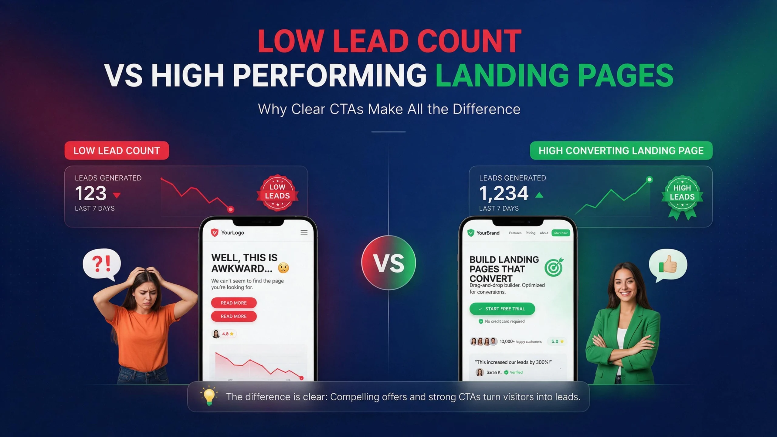
More traffic is not always the answer.
If 10,000 people visit your website every month but only 50 contact you, buying more traffic can simply mean paying to send more people into the same broken funnel.
Conversion rate optimization, or CRO, starts somewhere else.
Find the points where visitors hesitate, get confused, lose trust, abandon a form, or simply cannot figure out what to do next.
Fix those points.
A website that turns 1% of visitors into leads and moves to 2% does not need twice the traffic to generate twice the leads. The traffic stays the same. The website gets better at converting.
That is the basic CRO opportunity.
No CRO change can guarantee that your leads will double. Results depend on traffic quality, offer, pricing, audience, industry, brand trust, and the existing conversion rate. But when a website has obvious conversion problems, fixing several of them can drive big gains without increasing the ad budget.
Here are five CRO fixes worth checking first.
Why More Traffic Is Not Always the Answer
Most businesses look at a traffic report and ask one question:
How do we get more visitors?
That is useful, but incomplete.
A better question is:
What happens after visitors arrive?
Imagine a local service website gets 5,000 monthly visitors and generates 50 qualified inquiries. That is a 1% visitor-to-lead rate.
If traffic increases to 10,000 visitors but the conversion rate stays at 1%, the business gets about 100 inquiries.
But if the website improves from 1% to 2% while traffic stays at 5,000, the business also gets about 100 inquiries.
That is why CRO matters.
You are improving the output from traffic you already paid for through SEO, Google Ads, social media, referrals, email, or content.
The first job is not redesigning the entire website.
The first job is finding where potential customers disappear.
Find Where Leads Disappear
Start with actual behavior.
Look at:
- Landing pages
- Contact form starts
- Contact form submissions
- Phone clicks
- Email clicks
- Booking starts
- Booking completions
- Add-to-cart events
- Checkout starts
- Purchases
- Mobile versus desktop performance
- Traffic source
- Device type
- Page-level conversion rates
Google Analytics currently uses key events to identify important actions for a business. A lead form submission can be tracked as a key event, allowing you to analyze the paths users take before completing the form.
This matters because pageviews alone tell you very little.
A page can receive 20,000 visitors and generate almost nothing.
Another page can receive 2,000 visitors and produce 80 qualified leads.
The second page may be the better business asset.
Measure the action that actually creates value.
Fix #1: Make the Primary CTA Impossible to Miss
Your visitor should never have to ask:
“What am I supposed to do here?”
This happens constantly.
A service page might have a large hero image, a headline, three paragraphs of company history, several navigation links, social icons, four different buttons, and finally a tiny “Contact Us” link.
The website technically has a CTA.
The visitor still has no clear path.
Your primary CTA should tell people what happens next.
Weak:
Submit
Better:
Request a Free Quote
Weak:
Learn More
Better:
See How We Can Improve Your Website
Weak:
Contact
Better:
Book a 15-Minute Consultation
The exact wording depends on the business.
The principle is simple.
Make the next action obvious.
One Page, One Main Action
This does not mean every page needs only one button.
It means every important page should have a clear primary conversion goal.
A service page should not compete equally between:
- Read our blog
- Follow us
- Meet the team
- View our history
- Download our brochure
- Contact sales
- Subscribe
- Book a call
Too many equal choices create friction.
For a lead-generation page, decide what matters most.
Maybe it is:
Request a Quote
Then make that action visually obvious.
Place it where users naturally look:
- Near the top
- After the main value proposition
- Near important proof
- Near pricing or service details
- At the end of the page
- On mobile where appropriate
Do not rely on the navigation menu to carry your conversions.
Your visitor should be able to understand the next step without hunting.
Fix #2: Remove Friction From Your Forms
Forms are where many websites lose leads.
A visitor can be interested.
They can trust the business.
They can like the offer.
Then they see this:
Name
First Name
Last Name
Company
Job Title
Address
City
State
ZIP
Phone
Website
Budget
How did you hear about us?
Tell us about your project
Upload a file
Subscribe to newsletter
And they leave.
The business may think:
“We need this information.”
The visitor thinks:
“This is too much work.”
Those are very different perspectives.
Baymard’s recent ecommerce research continues to show the relationship between form complexity and usability. Its 2024 research found an average checkout contained 11.3 form fields, while its testing found that the number of fields users must deal with matters more than simply counting checkout steps.
For lead-generation websites, the lesson is not “every form must have three fields.”
The lesson is:
Every field should earn its place.
Ask Only What Sales Actually Needs
Before keeping a field, ask:
Will this information change what happens after submission?
If not, remove it.
If the sales team only needs:
- Name
- Phone
- Project details
Start there.
You can collect additional information later.
A lead who submits four useful fields is better than a potential lead who abandons a twelve-field form.
For ecommerce, the same principle applies to checkout.
Baymard’s current checkout research reports that 63% of mobile ecommerce sites and 64% of desktop sites in its 2025 benchmark had mediocre or worse checkout UX. Its research also identifies unnecessary fields, unclear requirements, poor error handling, and other interaction problems as recurring issues.
Make Form Errors Easy to Fix
A form should not simply say:
“There was an error.”
Which field?
What went wrong?
What should the visitor enter?
W3C’s WCAG guidance says automatically detected input errors should identify the field and describe the error in text.
Good:
Email: Please enter a valid email address.
Bad:
Invalid submission.
Good error handling reduces confusion.
It also helps accessibility.
W3C recommends properly labeling form controls so users and assistive technologies can understand what each control is for.
That is not just an accessibility concern.
Clear forms are easier for everyone to use.
Fix #3: Rewrite the Above-the-Fold Message Around the Customer
Your homepage may look beautiful.
That does not mean it communicates value.
One of the most common CRO problems is writing about the company instead of the customer.
Example:
“We are a full-service digital agency with over 15 years of experience.”
That tells the visitor about you.
Try:
“Get a Faster WordPress Website That Converts More Visitors Into Leads.”
Now the visitor immediately understands the problem you solve.
The first screen should answer three questions quickly:
What do you do?
Who is it for?
Why should I care?
If those answers are unclear, visitors have to work to understand your offer.
Most will not.
Match the Message to Search Intent
Do not send every visitor to the same generic homepage.
Someone searching:
emergency plumber in Miami
has a different intent from someone searching:
commercial plumbing maintenance
Someone searching:
WordPress speed optimization
has different intent from someone searching:
WordPress developer
The landing page should reflect that intent.
If someone searches for WordPress speed optimization and lands on a page that spends the first 600 words discussing general web development, the message is mismatched.
The visitor wanted one thing.
Give them that thing.
This is where SEO and CRO overlap.
Better targeting can bring more relevant visitors.
Better messaging can help those visitors take action.
You do not need more traffic if your existing traffic is landing on the wrong page.
Fix #4: Speed Up the Mobile Experience
This is where technical optimization becomes CRO.
A slow website creates friction before the visitor even sees the offer.
The visitor taps.
The page begins loading.
Nothing useful appears.
They wait.
A script blocks interaction.
An image shifts the page.
The browser freezes.
The visitor leaves.
You lost the lead before your sales copy had a chance.
If you want to understand exactly how this happens and what to fix first, read our full breakdown of why your website’s mobile speed is killing your lead generation; it covers LCP, INP, CLS, and the WordPress-specific bottlenecks most businesses miss.
For CRO, the important point is simple:
Performance is part of the conversion experience.
Performance Is Not Just a PageSpeed Score
Do not optimize a website only because a testing tool gives it a number.
Look at the actual problems.
For example:
- Huge hero images
- Render-blocking CSS
- Unused JavaScript
- Third-party scripts
- Heavy page builders
- Excessive plugins
- Poor caching
- Slow hosting
- Font loading problems
- Layout shifts
- Long main-thread tasks
- Slow server response
- Unoptimized WooCommerce functionality
A page can have a reasonable desktop score and still feel terrible on a mid-range mobile device.
That is why field data matters. We cover this in detail in our guide on why PageSpeed scores don’t matter as much as most people assume.
The real customer experience matters more than making a test report look pretty.
This is also where root-level WordPress optimization can produce a CRO benefit.
Removing unnecessary scripts, properly minifying CSS and JavaScript, improving caching, optimizing images, reducing plugin overhead, and fixing server-side bottlenecks can reduce friction throughout the funnel.
The goal is not:
“Get 100/100.”
The goal is:
“Make it easier for the customer to complete the action.”
Fix #5: Add Proof Where the Decision Happens
Trust is not something you should hide on an “About Us” page.
Put proof next to the decision.
If the visitor is deciding whether to:
- Request a quote
- Book a consultation
- Buy a product
- Start a subscription
- Call your business
show relevant proof nearby.
This can include:
- Customer reviews
- Case studies
- Specific results
- Before-and-after examples
- Client logos
- Certifications
- Guarantees
- Product ratings
- Security information
- Clear return policies
- Relevant testimonials
But do not dump 40 testimonials into one section.
Match proof to the concern.
If you sell expensive website development, show examples of websites you built.
If you sell SEO, show measurable SEO outcomes.
If you sell a medical service, explain credentials and provide appropriate trust information.
If you sell ecommerce products, make shipping, returns, payment, and product information easy to understand.
Proof Should Support the CTA
Imagine a visitor reads:
“Ready to improve your website?”
Then immediately sees:
“Trusted by hundreds of businesses.”
That is better than putting the same statement somewhere near the footer.
Even better is specific proof.
Instead of:
“We deliver amazing results.”
Use:
“Reduced page load time from 6.2s to 1.4s on a lead-generation website.”
Specific evidence is easier to understand.
The same principle applies to ecommerce.
Baymard’s recent payment UX research emphasizes that users need confidence around payment details, total cost, security, and what happens when something goes wrong.
Trust is not decoration.
It removes uncertainty.
Stop Sending Every Visitor to Your Homepage
The homepage is not a universal landing page.
It has too many jobs.
It introduces the company.
It supports navigation.
It explains products or services.
It may target multiple audiences.
It may rank for branded searches.
It may contain company information.
A dedicated landing page has one job.
That makes it easier to optimize.
For example:
/wordpress-speed-optimization/
can focus entirely on WordPress performance.
/hvac-web-design/
can focus entirely on HVAC businesses.
/emergency-plumber/
can focus entirely on emergency plumbing.
The visitor arrives.
The headline matches the search.
The offer is clear.
The proof is relevant.
The CTA is obvious.
That is a much cleaner conversion path.
Build Dedicated Landing Pages
Good landing pages do not need to be complicated.
A strong structure can be:
Problem
What is going wrong?
Outcome
What does the customer want?
Solution
How do you solve it?
Proof
Why should they believe you?
Process
What happens next?
CTA
What should they do?
For example, a WordPress speed page might open with:
Your WordPress Website Is Slow. We Fix the Problems Causing It.
Then explain:
- What is slowing the site
- What gets optimized
- What happens during the audit
- What tools are used
- What results have been achieved
- What the client receives
- How to start
That is much stronger than:
“Welcome to our digital agency.”
Fix Broken Contact and Booking Flows
This sounds obvious.
Many businesses still lose leads here.
Test the complete journey yourself.
Do not just test whether the page loads.
Submit the form.
Call the number.
Book the appointment.
Use a phone.
Use Chrome.
Use Safari.
Try a slow connection.
Check the confirmation.
Check the email notification.
Check the CRM.
Check whether the sales team actually receives the lead.
A form that displays “Thank you” but never sends the lead notification is not a functioning conversion system.
Neither is a booking form that works on desktop but fails on mobile.
Neither is a phone number that is visible but not clickable on mobile.
CRO is not only about design.
It is about the entire path from visitor to customer.
Use Analytics Before Changing the Design
Do not redesign a website because you personally dislike the hero section.
That is not CRO.
That is preference.
Start with evidence.
Google Analytics lets you define important actions as key events and analyze how users reach those actions. Google specifically documents lead-generation form submissions as an example of an important key event.
Track things such as:
Page view → CTA click → form start → form submit
For ecommerce:
Product view → add to cart → checkout → purchase
Now you can identify the leak.
Example:
100,000 visitors
↓
12,000 product views
↓
3,000 add to carts
↓
1,000 checkout starts
↓
400 purchases
Do not randomly optimize the homepage.
Look at the biggest problem in the funnel.
If thousands of people add products to carts but only 400 purchase, checkout deserves investigation.
If visitors rarely click the CTA, the problem may be messaging or offer clarity.
If visitors start the form but do not submit, form friction deserves attention.
Measure first.
Then change.
Track Micro-Conversions
Not every visitor is ready to buy immediately.
That does not mean their behavior is useless.
Track meaningful actions such as:
- CTA clicks
- Phone clicks
- Email clicks
- Form starts
- Form submissions
- Pricing-page visits
- Booking starts
- Downloads
- Product views
- Add-to-cart
- Checkout starts
- Video engagement
But do not treat every click as a business conversion.
A visitor scrolling 90% down a page is not the same as someone requesting a quote.
Google Analytics separates important business actions as key events and allows businesses to use those events for reporting and optimization.
Your tracking should reflect the actual business goal.
A/B Testing Without Guessing
Once you identify a problem, test the solution.
Do not change ten things at once and then claim the redesign increased conversions.
You will not know what caused the result.
A cleaner experiment might test:
Version A: “Get a Free Quote”
Version B: “Request Your Project Estimate”
Or:
Version A: Long form
Version B: Short form
Or:
Version A: Generic headline
Version B: Problem-focused headline
The goal is not to make the page prettier.
The goal is to learn what helps users complete the desired action.
For low-traffic websites, formal A/B testing can take a long time to reach useful confidence.
That does not mean you cannot improve the site.
Use multiple evidence sources:
- Analytics
- Search data
- User recordings
- Heatmaps
- Form abandonment
- Customer questions
- Sales-team feedback
- Support tickets
- Direct user feedback
Then make controlled changes.
CRO for Local Service Businesses
Local businesses often have a simple conversion goal:
Get the visitor to call, book, or request a quote.
Do not bury those actions.
A local service page should quickly communicate:
Service
What do you provide?
Location
Where do you provide it?
Availability
When can the customer get help?
Trust
Why should they choose you?
Action
What should they do now?
For example, an HVAC company can build dedicated pages for:
- AC repair
- AC installation
- Heating repair
- Emergency service
- Commercial HVAC
Each page can target a specific problem and location.
The CTA can then match the intent.
Call for Emergency AC Repair
is stronger than:
Learn More About Our Services
when the visitor is actively searching for emergency repair.
CRO for Ecommerce Stores
Ecommerce CRO has another layer.
The visitor must move through more steps:
Product discovery → product page → cart → checkout → payment → confirmation
Every step creates potential friction.
Baymard’s current research places global cart abandonment at around 70%, based on its long-running dataset, and its checkout research identifies significant usability problems across both desktop and mobile ecommerce experiences.
That does not mean every abandoned cart can be recovered.
It means the checkout deserves serious attention.
Look for:
- Unexpected costs
- Unclear shipping
- Forced account creation
- Too many fields
- Poor mobile layout
- Confusing error messages
- Weak payment confidence
- Slow checkout
- Missing product information
- Difficult coupon handling
- Poor return information
Baymard’s research also shows that reducing unnecessary form fields can improve checkout usability, with its 2024 benchmark finding 11.3 fields on average compared with its finding that many checkouts could function with fewer.
Do not optimize ecommerce checkout by blindly making it shorter.
Optimize the actual work users must perform.
What Not to Change
CRO does not mean changing everything.
Do not remove useful information simply because you want a shorter page.
Do not hide important pricing information to force users into a sales call.
Do not add fake urgency.
Do not add popups every five seconds.
Do not make the CTA visually aggressive.
Do not remove navigation when users genuinely need it.
Do not sacrifice accessibility for aesthetics.
Do not remove product details because someone told you “short pages convert better.”
Do not assume a competitor’s layout will work for your audience.
And do not chase a higher conversion percentage while lead quality collapses.
If your conversion rate rises from 2% to 4% but half the new leads are useless, the business may not have improved.
Measure qualified leads, not just raw submissions.
How to Prioritize CRO Work
You do not need a six-month CRO project to find useful improvements.
Start with the biggest leaks.
Use a simple framework:
Impact
How many users experience the problem?
Severity
How badly does it affect their ability to convert?
Confidence
Do you have evidence that this is actually happening?
Effort
How difficult is the fix?
A broken mobile form can affect a huge percentage of visitors and may be relatively easy to fix.
That should probably be investigated before changing the color of a button.
A 3% difference in button color is not more important than a form that fails.
Technical problems come first.
Conversion clarity comes next.
Visual polish comes after that.
30-Day CRO Plan
You can structure the first month like this.
Week 1: Measure
Set up or audit analytics.
Define key events.
Track leads, phone clicks, form submissions, bookings, add-to-cart, checkout, and purchases where relevant.
Identify the highest-value pages.
Week 2: Remove Friction
Test forms.
Test mobile.
Test contact flows.
Test booking.
Test checkout.
Fix broken links.
Fix confusing errors.
Remove unnecessary fields.
Week 3: Improve Messaging
Rewrite weak headlines.
Clarify offers.
Strengthen CTAs.
Add relevant proof.
Create dedicated landing pages for important search intent.
Week 4: Test and Measure
Compare performance before and after.
Review key event rates.
Look at lead quality.
Identify the next bottleneck.
Then repeat.
CRO is not a one-time redesign.
It is a loop:
Measure → Find friction → Fix → Test → Measure again.
That is how you turn CRO from opinion into a process.
Conclusion
You do not always need more traffic.
Sometimes you need to stop wasting the traffic you already have.
Start with the five areas that create the most obvious friction:
Make the CTA clear.
Reduce form friction.
Make the message about the customer’s problem.
Improve mobile performance.
Put proof next to the decision.
Then measure what happens.
A website generating 50 leads from 5,000 visitors has a different problem from a website generating 500 leads from 50,000 visitors.
Traffic tells you how many people arrived.
CRO tells you what happened after they arrived.
That distinction matters.
For WordPress websites, CRO often overlaps with development, technical SEO, UX, and performance optimization. A slow script, broken form, bloated plugin stack, poor mobile layout, or weak landing-page structure can all become conversion problems.
If your website has performance issues contributing to lead loss, our WordPress speed optimization services are designed to remove that friction at the root level.
The strongest CRO work does not begin with:
“Let’s redesign the website.”
It begins with:
“Where are potential customers getting stuck?”
Find that point.
Fix it.
Measure the result.
Then move to the next bottleneck.
Traffic tells you how many people arrived. CRO tells you what happened after they arrived. That distinction matters. If you want help identifying exactly where your potential customers are getting stuck, book a free call and we will walk through your funnel together.
FAQs
Can CRO really double website leads?
It can happen, but there is no universal guarantee. A website with serious conversion problems has more room for improvement than one that is already highly optimized. Doubling leads can also come from several smaller improvements working together rather than one dramatic change.
What should I optimize first?
Start with the biggest measurable bottleneck. Check forms, CTAs, mobile performance, landing-page messaging, booking flows, and checkout. Use analytics to identify where users are dropping out before changing the design.
How many fields should a lead-generation form have?
There is no universal number. Keep the fields required to qualify and process the lead, then remove anything that does not provide enough business value to justify the extra friction. Ecommerce research from Baymard shows that unnecessary form fields can significantly increase interaction effort.
Does website speed affect conversion rate?
Speed can affect the user experience and therefore can affect conversion behavior. Core Web Vitals measure loading, responsiveness, and visual stability through LCP, INP, and CLS. The practical goal should not be chasing a perfect laboratory score. The goal is making important pages fast and responsive for real users.
What should I track for CRO?
Track actions connected to business value. For lead generation, this can include form submissions, phone clicks, booking completions, and qualified leads. For ecommerce, track product views, add-to-cart, checkout starts, purchases, and revenue. Google Analytics supports defining important user actions as key events so you can analyze those behaviors across your traffic sources.